
Before we get started, here is a link to the Tableau Viz I will be discussing, the workbook can be downloaded from there if you have a copy of Tableau, otherwise everything except the data pane will be view-able online. To get the most out of this post I suggest following along with me using either method.
What’s this post about?
I have been teaching myself data analysis using SQL and Python recently and given Tableau’s prevalence in industry decided it would be worth learning for data visualization. This being my first real data visualization with Tableau the focus of this article will be on how I put my dashboard together, I won’t really go into what might be learned from the data itself. To learn the interface and what the software could do, I watched some of the training videos here.
Choosing a Data Source
One reason I chose to work with the census data is that I already had access to the shape files representing the census tracts for this region. These files are what describe the geographical boundaries of each tract so that it can be drawn on a map. Census data is also freely available from here (with an example search here if you need some help getting started on your own). The format in which data is returned also makes it easy to work with and link up multiple tables using the census tract as a common identifier.
There are a broad range of categories and levels of geographic detail to choose from, making it easy to find something interesting to visualize in the data. I ended up pulling quite a bit more data than I actually used for my Viz (what Tableau calls visualizations made with their software), and then deciding on a few categories to compare from that smaller set. Pulling the extra data also ended up being useful, in part, for understanding what certain categories represented by adding up values in sub-categories and checking to make sure they matched.
Preparing the Data
The first thing I did was get my population data and take a quick look through what was in my table for any obvious problems. It’s a small data set so I just did a visual inspection to look for any bad records. I saw two rows with all null values which I removed, and that was it for missing data in the population table. The geography field also wasn’t in a format I wanted, so I split off the census tract value into its own column. I didn’t end up using the population data for anything in this project except as a base to do my joins later but removing the rows with null data here meant not having to worry about removing those rows in the other tables thanks to using joins.
Now that I had one table I was comfortable with I got the rest of my demographic data like language use, employment numbers, etc. and broke up the geography field again so that the census tract was its own field. I realized later I had not pulled the median income data, so I went back and got that in a separate table as well.
Having all my data available it was time to join it together in Tableau. I would recommend anybody who wants to use Tableau understand how all the basic database joins work beforehand, because it makes the setup process go by much faster. In this case I knew before getting to the data connections that I would need to do three left outer joins on my population table, so this part only took a minute.
If you know SQL, what Tableau is doing here is just SELECT * FROM pop2016 LEFT OUTER JOIN [whatever table] ON pop2016.CT = Census_Tract
I also took this chance to look for duplicated fields I wouldn’t be using. For example, I used the income over 100,000 field in my charts, so I hid all the breakdowns of income over that value to make it easier to find what I needed. There are many more unused fields that can be hidden now that I have a finished dashboard, but for now I’m leaving them visible in case I decide to turn this into a Tableau story in the future.
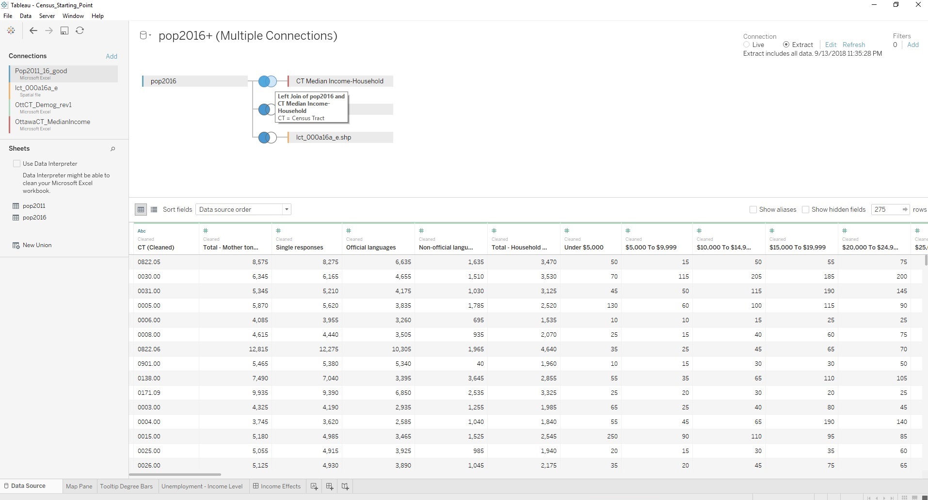
The Data Source tab is unavailable in the online viewer, to see what it looks like with the connections made and a join highlighted, click on this image.
Setting up the Main Chart
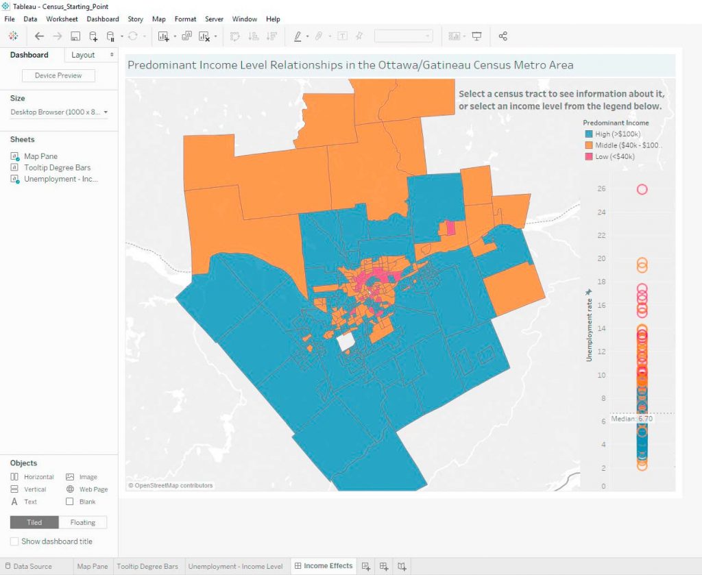
One of my goals with this project was to get a feel for the map feature, so the first thing I did once my data was connected was create a map on a worksheet. I just dragged the Geography measure into the chart area and there it was with boundaries all set up.
I decided then that I wanted to look at income levels but didn’t see an obvious way to do that directly with the data. My solution was to create the predominant income measure. To do this I created three categories (Low, Medium, High) and defined them as the sum of all people making an income within that range. The low income bracket is all people making under $40,000 a year, the middle bracket is from $40,000 to $99,999, and the high income bracket is $100,000 a year and over. For the low income category, I looked into what it would cost to support a family of 3 in a city like Ottawa and chose a number somewhat above that for the low-income cut-off. The high category’s cut-off is an arbitrary amount, it just seemed like a good boundary since it is both 2.5x the lower threshold and a convenient round number.
Now that I had each category of income, I needed to create a single categorical variable to represent each census tract’s most common income level. The predominant income measure simply compares the value in each of the three income categories and assigns whichever one has a plurality of the population in each census tract. Note that the median income for a census tract is often not in the range of its predominant income level, and because this might be misleading it was important to me that the median income was also available to users.
To show the median income of an area, I first tried placing a label on each census tract on the map, but it looked cluttered and was useless from a readability standpoint. In retrospect this should have been obvious, though sometimes you have to see it for yourself. Then I realized that the tool-tip was still completely unused, and I had already spent time watching some videos on making tool-tips more interesting, so it was time to put that knowledge to use. I added the median in the tool-tip menu, and now I was able to see the census tract number and median income when I hovered over any area. But that didn’t seem interesting enough to me and I decided to go even farther to give users a reason to read through the tool-tips.
Making a Chart for the Tool-tip
Something cool you can do in Tableau is add one worksheet’s chart into another’s tool tip. Knowing I wanted to try out this feature I had to decide what would be interesting to look at along with predominant income level and median income. The factor that I decided on was level of education.
At this point I had to do a bit of work to make sure I understood what each of the four levels of education I was using represented, like which category counted CEGEP students. To do this check I added sub-categories I expected to be covered by my four major categories and made sure the totals matched.
Once I felt I understood what I was working with, I set up the data as a series of bar charts. While the education worksheet makes no sense on its own to look at, when you hover over a census tract on the map worksheet it filters the series of bar charts to only display the one matching that census tract.
When coloring the chart based on level of education, I was careful to choose a series of colors that not only were different from the predominant income level colors but also didn’t imply a hierarchy in the levels of education. Color selection is also somewhat challenging for me thanks to mild color-blindness, so there is a definite pattern to the colors I end up using which I need to be aware of when aiming for variety like I did here.
The only major issue with using tool-tip charts is that the legend can’t be carried over. To get around this I use labels that are matched to the colors of the bar chart and position them below it where you might expect x-axis labels to be anyways.
One Last Chart for a Dashboard
Realizing at this point that I wanted to do more than just a single worksheet, I considered what else I might want to put on my dashboard. I settled on making an unemployment rate chart that displayed the predominant income level for each data point using the same coloring as the map pane. This gave a factor to link the map worksheet to the unemployment data besides just location. Adding the median line to the data also makes it easy to take some information away from the chart at a glance, since it shows the median unemployment for each category or each census tract (whichever is highlighted) while still showing the overall median for comparison.
Putting it all Together
Now I just had to arrange my dashboard. The first change I made was matching the background colors for my charts to make the dashboard more visually consistent. Matching the colors also makes it more obvious that the whole dashboard is meant to be read together, not as separate pieces. I added a text box at the top right as well, to make sure anyone who wants to use the Viz understands the options available to them.
At this point I just had to make a couple of minor modifications to get the dashboard ready for use. I noticed after selecting different income levels that the unemployment rate chart was resizing its y-axis each time, making it harder to make a quick visual comparison. To solve that I simply went back and changed the axis to a fixed height. I also made sure I had hidden all the toolbars which can be hidden that the user didn’t need. Finally, I noticed that the ability to select a single census tract and see it highlighted had not carried over to the dashboard, so I used the actions menu and added an action enabling that function.
Finished dashboard
Using and Reading the Dashboard
Now that the design work is out of the way, some quick notes on how to use the finished dashboard. The legend in the top right shows the color assigned to each income level. By clicking on a color or category name there you can isolate that category in the map and unemployment rate views, selecting only census tracts that fall in that income level. To return to the original state of the dashboard after clicking something, just click on it one more time or double-click the background. Individual census tracts can also be selected for viewing by clicking on them on the map or unemployment chart, which will highlight that census tract and its unemployment rate.
A couple of final notes related to the unemployment chart. When reading the unemployment chart if a single census tract is selected then the median shown is just the actual unemployment value for that area (the median of a single value is that value). In general, when an income category or census tract is selected, the unemployment chart will show the current selection’s median as the most visible and the global median will still be visible but faded.
Thoughts on the Result
This has article has gone a bit longer than I had intended, so I will just point out one thing I find interesting on these charts. If you look at the unemployment rates by predominant income category, you will see that the values for the low and middle income categories have a much larger distribution than the high income category does.
That is all for this post. I hope you found it interesting and enjoy playing around with the dashboard. Feel free to leave comments with anything you feel should be changed or added, I’m doing this to learn! Contact information is also now available on the Contact Page.